Bidadari
Gateway to Batavia — an identity for an island destination off Jakarta, built to feel like it had always been there.
Client
Bidadari Island
Scope
Logo, brand system, pattern
Deliverables
Lockups, construction rules, palette, typography, repeating pattern
Sector
Travel & hospitality
The brief
Bidadari sits in the bay off Jakarta. Its tagline — Gateway to Batavia — carries the city's colonial-era name, which fixes the period the brand has to live in.
That was the whole problem. The identity had to read as old without becoming a costume: period enough to suggest the history, restrained enough that it still works on a booking page.
The mark
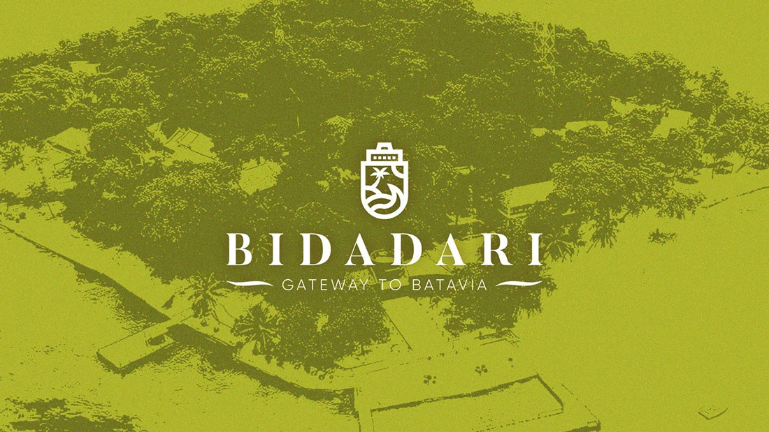
A crest holds a palm and the water inside one silhouette. Keeping both elements inside a single shape is what lets it survive at small sizes — nothing detaches or fills in when it shrinks to a luggage tag.
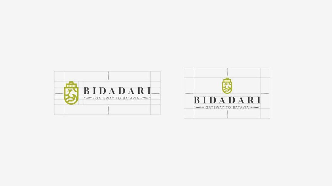
It ships as a horizontal lockup and a stacked one, so the mark never has to be squeezed into a space it was not drawn for.

Construction
Both lockups are drawn to a grid, with clear space defined around them. This is the part that keeps an identity intact once other people start using it — the rules travel with the artwork.
Colour
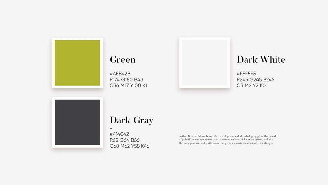
Green and dark grey do the ageing. Together they give the vintage impression the brand wanted, recalling the green of old Batavia, while an off-white keeps the whole thing from turning heavy.
Typography
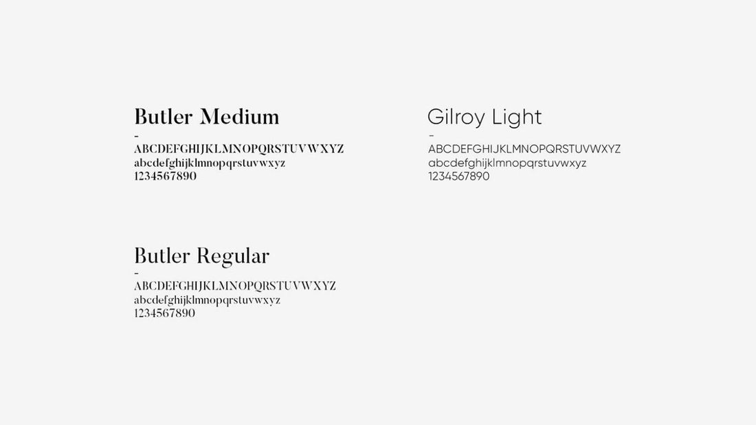
A high-contrast serif for the display setting, paired with a light geometric sans for everything that has to stay quiet.
Pattern
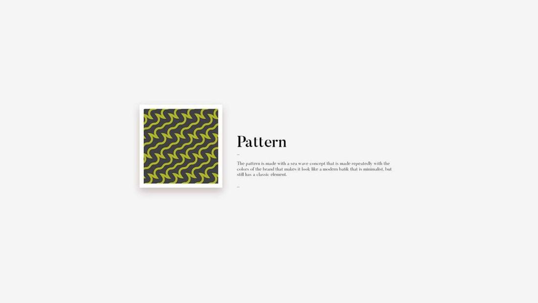
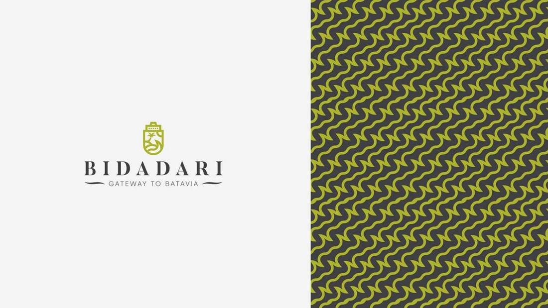
One sea wave, repeated. Held in the brand colours it starts to read as a modern batik — minimalist, but with a classic element still in it.
That is the balance the pattern has to strike: enough presence to cover a surface, quiet enough to sit behind a logo without fighting it.