HireHopping
A rebrand for a platform where businesses hire service providers and pay in cryptocurrency.
Client
HireHopping
Scope
Rebrand, logo, brand system
Deliverables
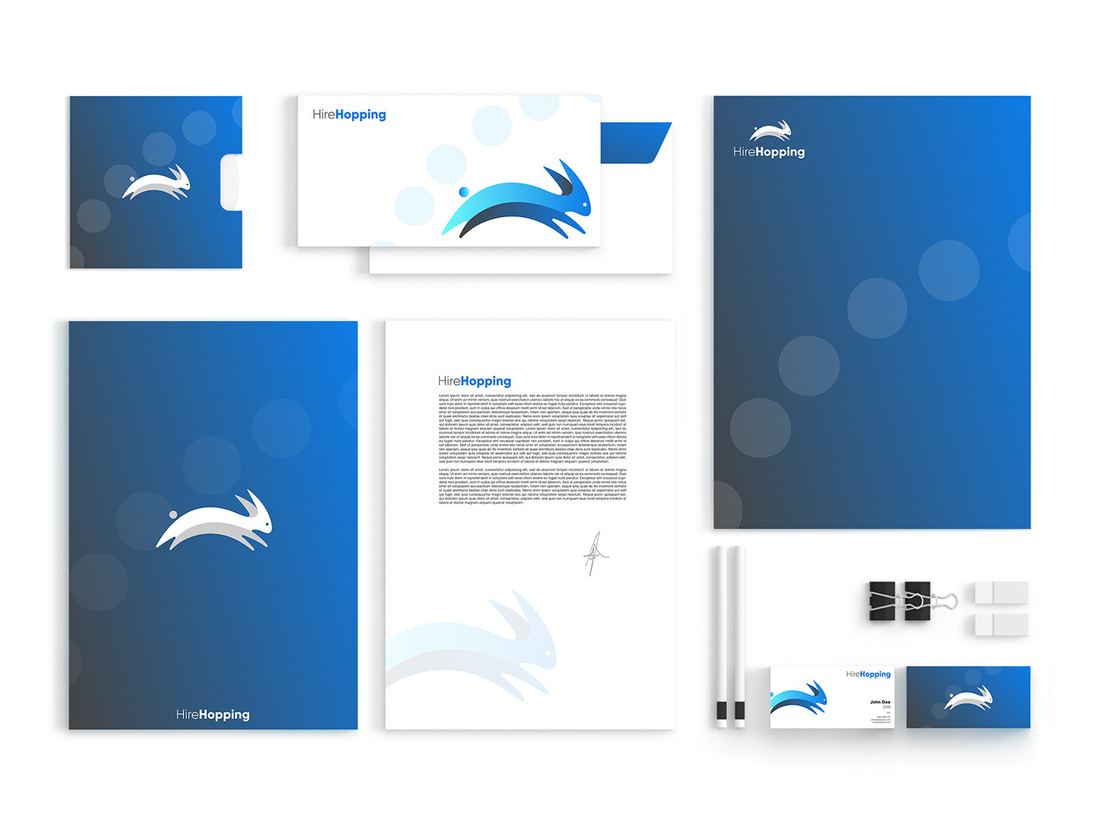
Lockups, colourways, palette, app icon, stationery
Sector
Platform · Crypto
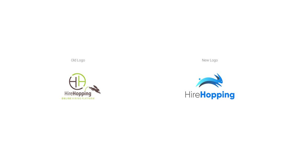
HireHopping connects business clients with service providers and settles the work in cryptocurrency. The product already existed; what it had was a mark that did not carry it. So this was a rebrand, not a first logo.
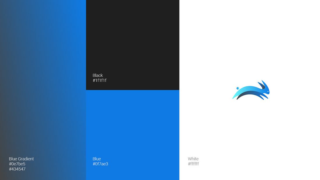
A hare mid-leap replaced the previous mark. The leap does the work — hopping from one hire to the next is the product, and the shape says it before the name does. A blue gradient carries the motion, black holds the type, and white keeps the interface legible. Three values, no more, so the system survives being applied by a product team rather than a designer.
The full presentation follows, in the order it was delivered.