ME 芽
A drinks brand for younger buyers, where the colour comes from the fruit and the brand stays out of its way.
Client
ME 芽
Scope
Logo, brand system, packaging
Deliverables
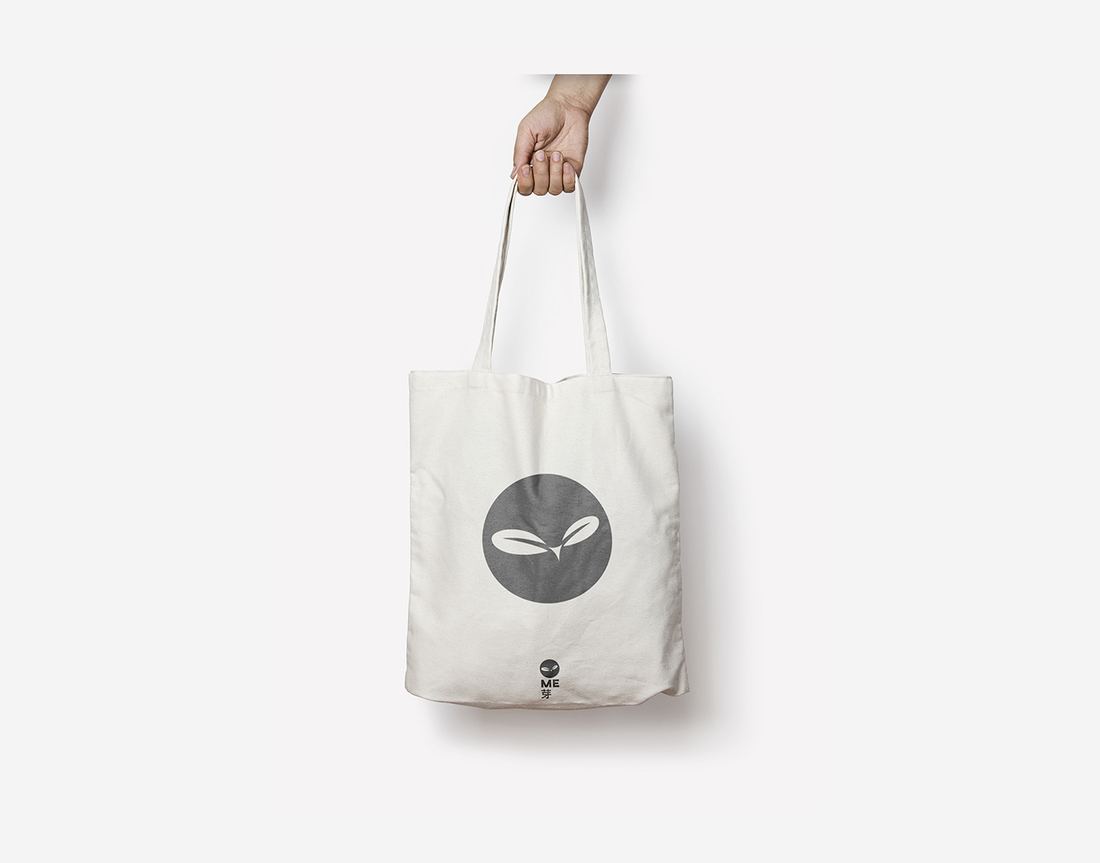
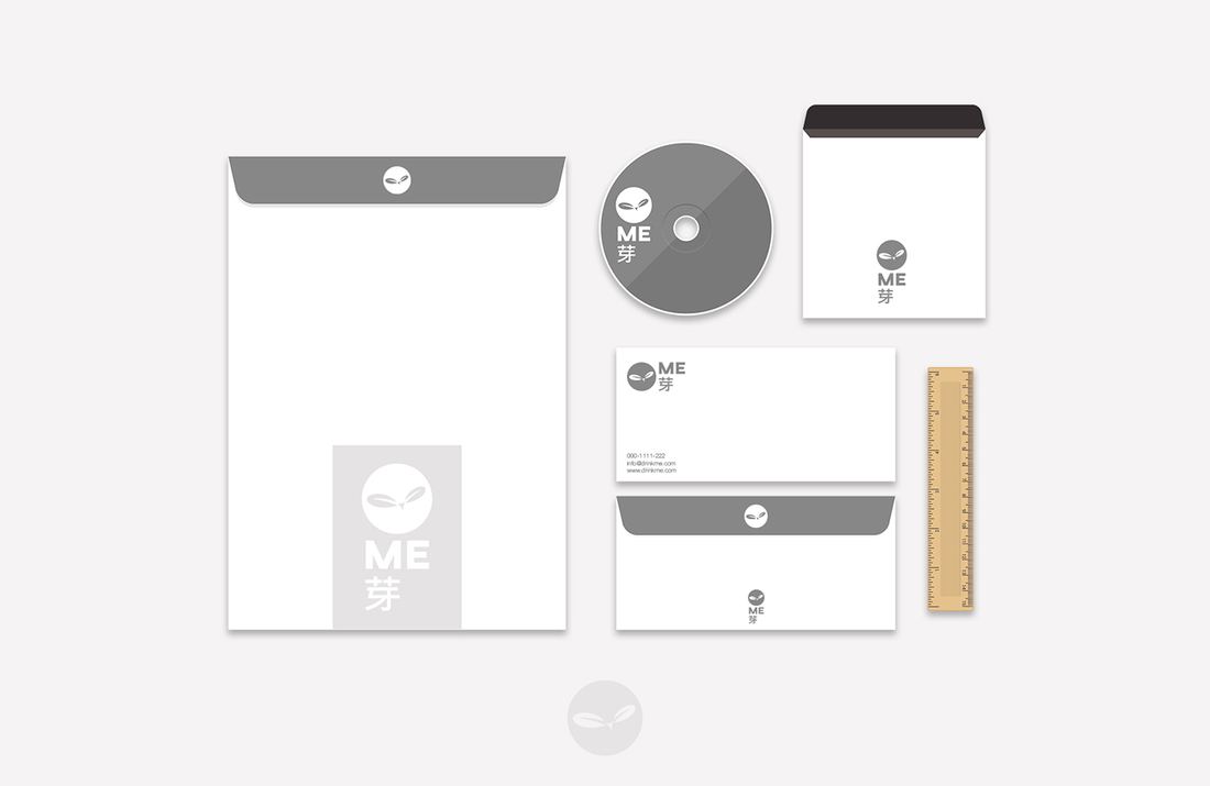
Mark, lockup, palette, bottle range, stationery, merchandise
Sector
Food & beverage
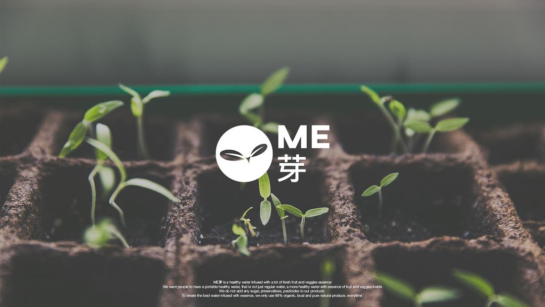
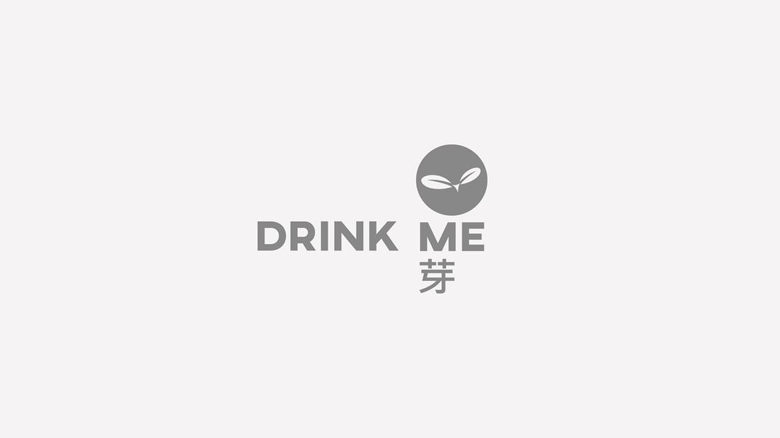
ME is a healthy drink range aimed at younger buyers. The Chinese character in the name means sprout, and that is the whole idea: something at the start of growing.
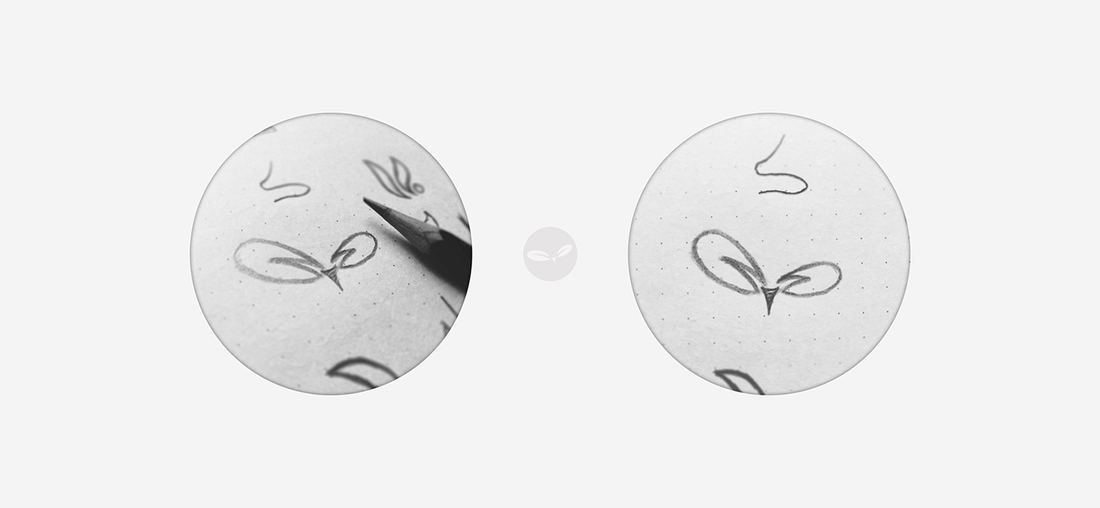
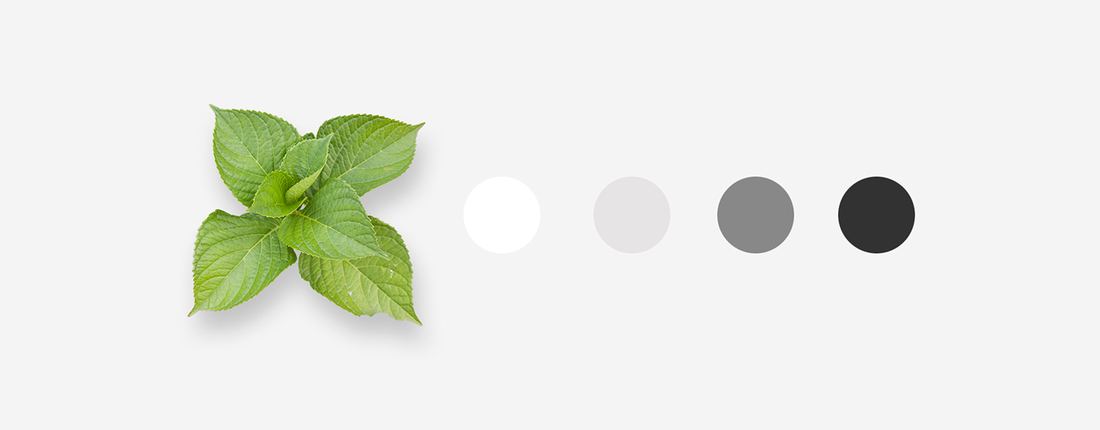
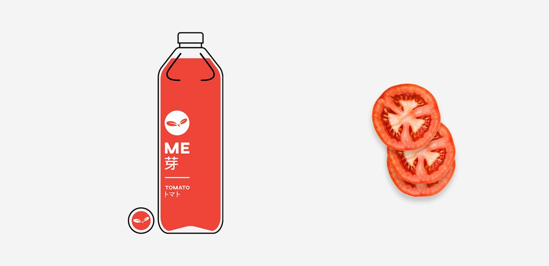
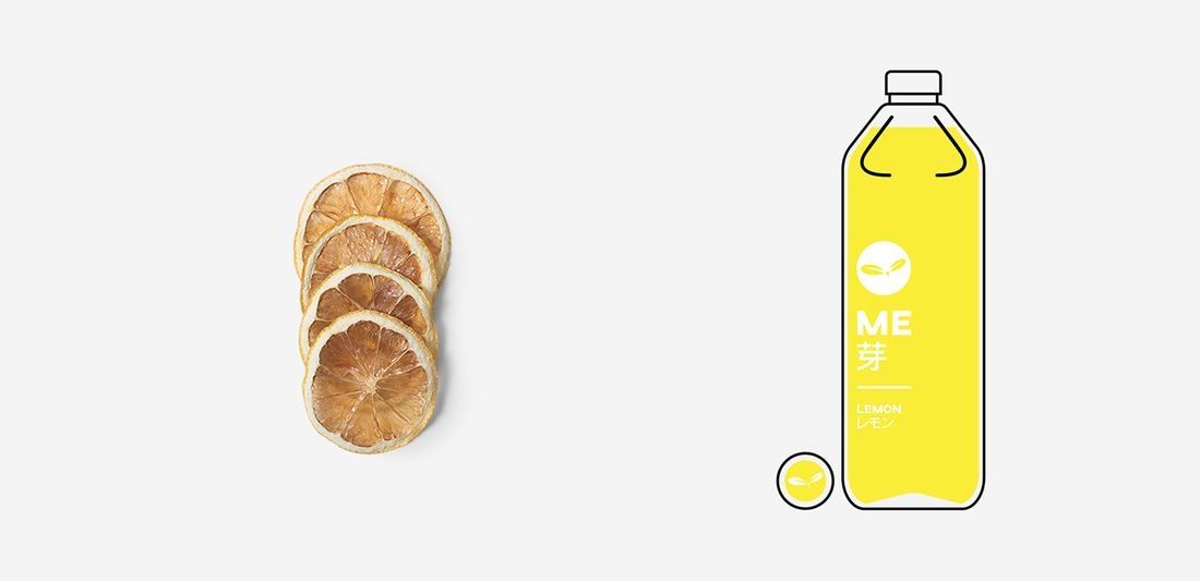
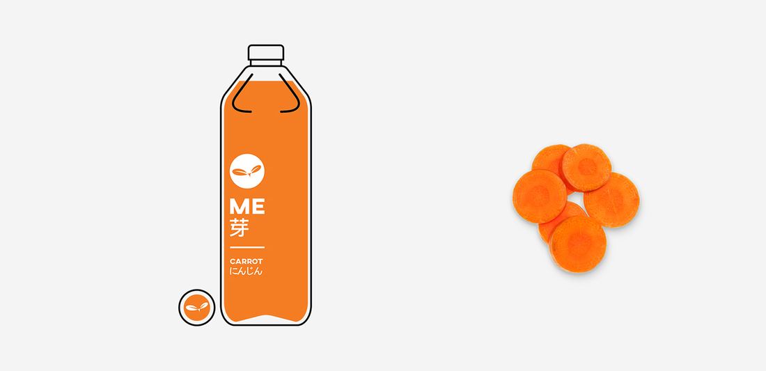
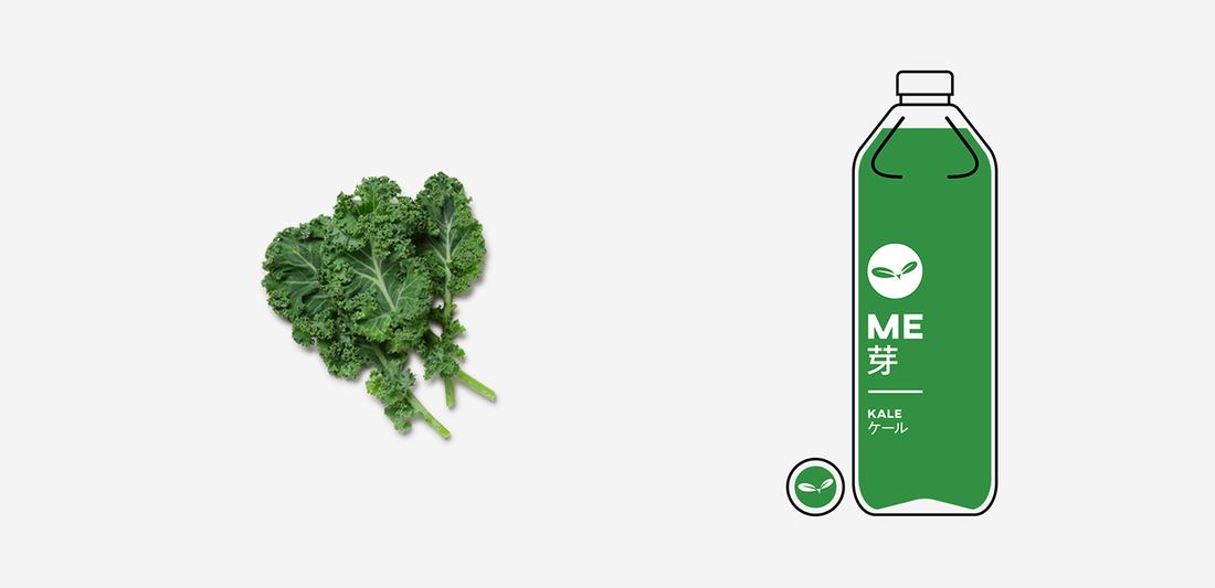
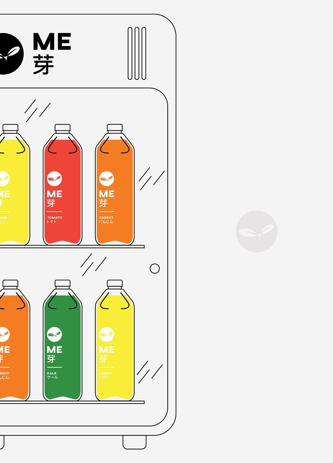
The mark is a sprout breaking out of a circle, drawn so the negative space does half the work. The brand itself stays greyscale; every colour on the shelf belongs to a flavour instead — tomato red, citrus yellow, carrot orange, kale green — so the range can grow without the identity being redrawn.
The full presentation follows, in the order it was delivered.