Tetomo
An identity for a skincare range and clinic, built to look clinical without looking cold.
Client
Tetomo
Scope
Logo, brand system, packaging
Deliverables
Mark, wordmark, palette, typography, packaging, signage
Sector
Skincare
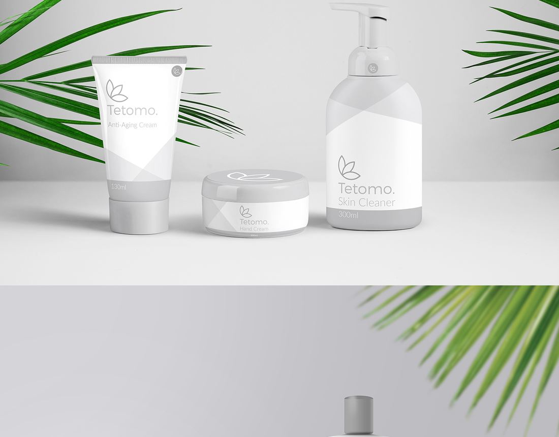
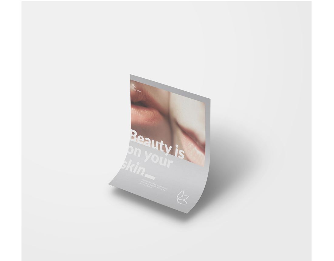
Tetomo makes skincare for face and hair and runs the clinic that sells it, at the affordable end of a category where most of the shelf is shouting. The identity had to read as formulation rather than as cosmetics.
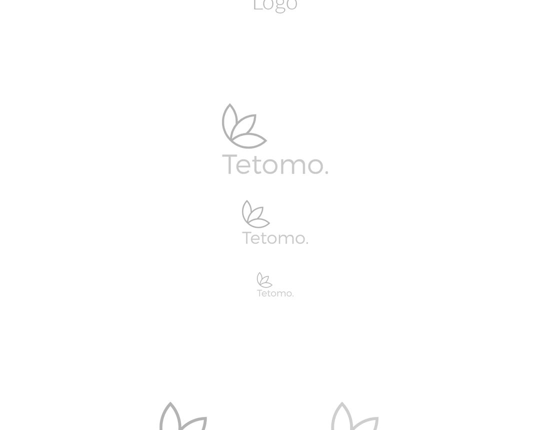
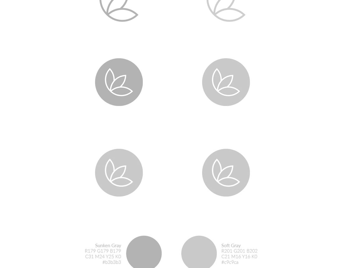
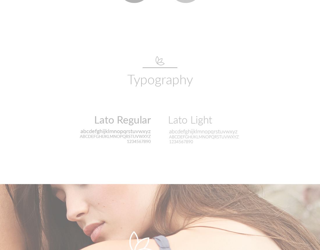
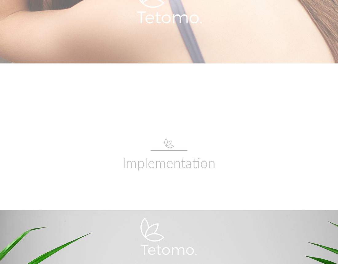
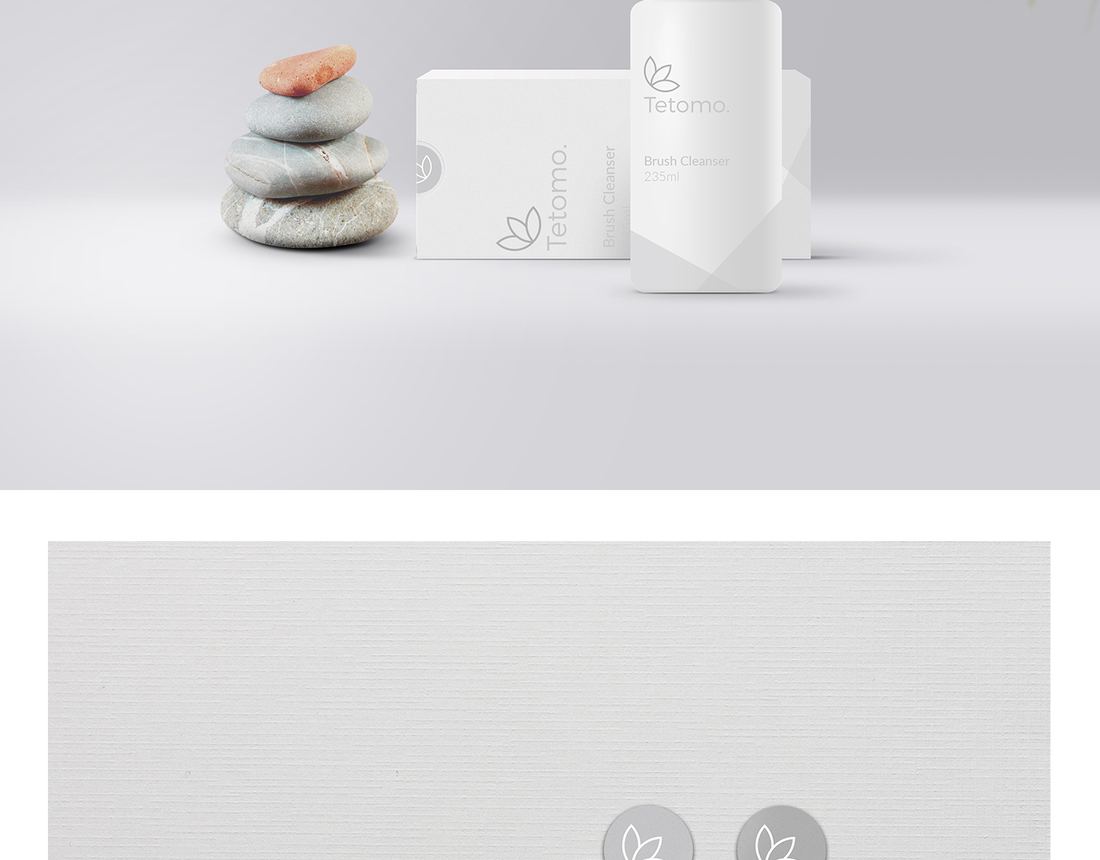
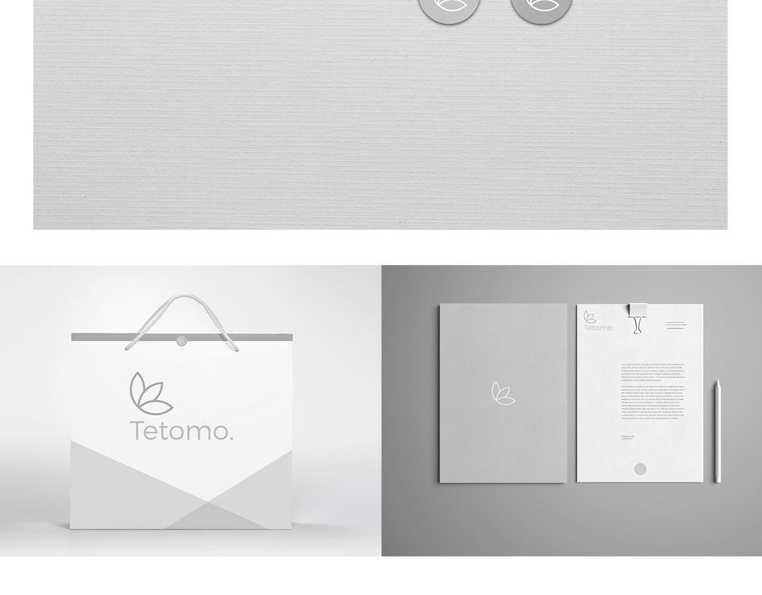
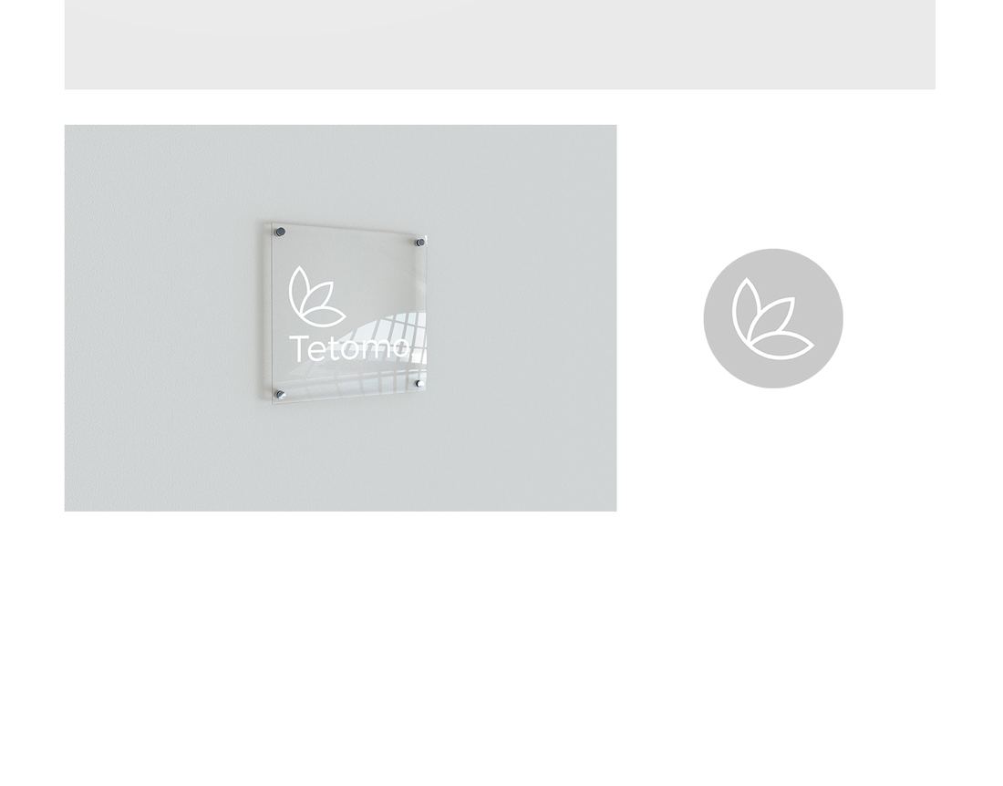
A leaf drawn as one unbroken line, with the stop after the wordmark doing the rest of the work. The line weight never changes, which is what lets it survive embossing, a tube and a window sign at the same time. Two greys and Lato carry everything else — removing colour from a skincare brand is a risk, and here it is the point, because the product photography supplies all the warmth the system needs.
The full presentation follows, in the order it was delivered.