Logo design for restaurants and cafes
A restaurant logo is judged on a takeaway bag, a cup and a delivery-app thumbnail long before anyone sees it on a website. Here is what it has to survive, and what that looks like in practice.
Where a restaurant logo actually lives
Not on a website homepage. It spends most of its time on things customers hold, and on very small screens.
Small and often cropped
A delivery-app listing, a map pin and a social profile picture show your mark at thumbnail size, often cropped to a square or a circle. If the mark only works wide, it disappears there first.
On paper, board and cloth
Takeaway bags, napkins, cups, bowls, stickers, menus and aprons. Many of these cannot print a gradient or a fine line, and some are printed in one ink on kraft or white stock.
Read from across the street
A sign has to say what you are in a second, from a distance. A long name in thin letters, or a symbol with fine interior detail, loses to something simple.
What a restaurant logo should be able to do
Design for this
- One clear idea that says what you serve or how you serve it
- A single-colour version for stamps, kraft bags, foil and cup sleeves
- A symbol that stands alone for app icons and social avatars, plus a horizontal lockup for signs and menus
- Strong shapes that survive at 16 to 32 pixels
- A palette limited enough to print the same on every surface
Common mistakes
- A logo made only for the website header
- Gradients, shadows and thin strokes that fail on packaging
- Stock food icons everyone else already uses
- A long name set so small that it is unreadable on a cup
- No reversed version for dark walls, aprons and window decals
A worked example: bevee
bevee is a vegetarian fast-food chain in Australia that sources from local farms and serves people who have about ten minutes. The mark had to say both things at once: quick, and credibly farm-fresh.
One shape doing two jobs
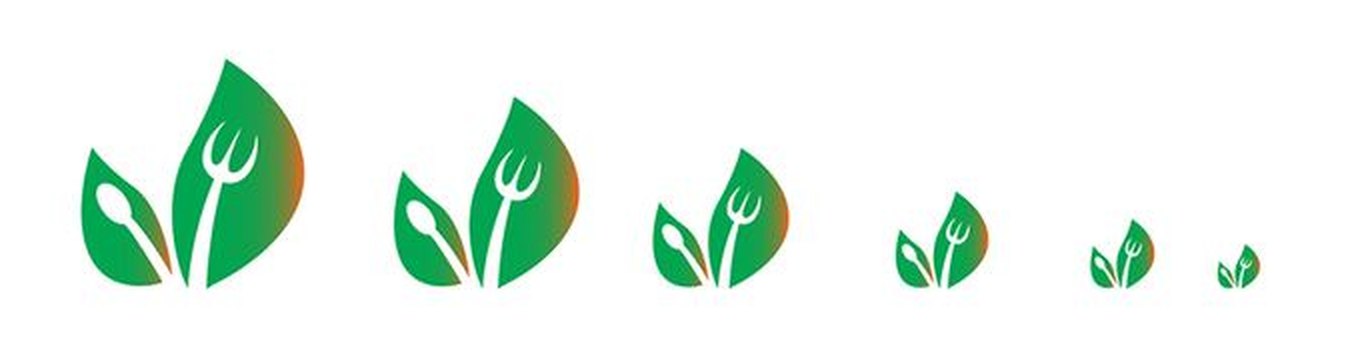
A fork hidden inside a leaf. The leaf is the produce, the fork is the speed, and the same outline carries both.
Drawn for brown paper
One green and one warm brown, where the brown appears as material — kraft bags and paper — rather than as ink. Every piece was drawn to survive as a single flat colour.
Delivered as a counter system
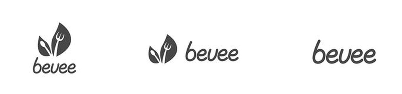
The mark stepped down through four sizes, horizontal and stacked lockups, a one-colour version, a reversed version, circular seals for stickers and packaging, then bags, napkin wraps, cups, bowls, letterhead and a website design.
What you receive
Whatever the package, a restaurant needs files for both screens and counters.
Vector master and print files
Scales from a favicon to a shopfront sign without softening, with CMYK and transparent versions your printer will accept.
Three to five directions
Separate directions, each with a reason behind it, so you choose the one that fits your food and your room.
Stationery and social kit
Business card and letterhead, plus profile and cover art sized for Instagram, Facebook and other channels, in the higher packages.

Questions people ask
What makes a good restaurant logo?
One clear idea that says what you serve or how you serve it, and a design that still works when it is very small, in a single colour, and printed on paper, board or cloth. It is judged on a cup, a bag and a delivery-app thumbnail, not on a website header.
Does a restaurant logo need a one-colour version?
Yes. Stamps, kraft takeaway bags, foil, engraving and many cup sleeves print in one ink. A logo built from gradients or fine detail has to be redrawn for these, so it is best to draw a flat one-colour version from the start.
How small does a restaurant logo need to work?
At roughly 16 to 32 pixels for a browser tab, app icon or social avatar, and legible on a napkin or cup. Drawing for the smallest size first constrains every curve above it.
Can you design a logo for a cafe or a food truck as well?
Yes. The same rules apply: a mark that works small, in one colour, and on packaging. Send a short brief about what you serve and who it is for.
How long does a restaurant logo take?
First concepts arrive in three days on the Basic package, four on Standard and five on Premium. Revisions on the chosen direction are unlimited.
Drawn by a human, from start to finish
From $70, first concepts in three days, unlimited revisions, and every file is yours at the end.