Logo design for skincare brands
A skincare logo lives on small, curved, tactile surfaces and has to look trustworthy before anyone reads the label. Here is what to design for, and what it looks like in a real identity.
What makes skincare branding different
A skincare logo is applied to small, curved, tactile surfaces, and has to earn trust before anyone reads the label.
Very little room
A tube, a dropper bottle or a jar lid leaves a small area for the mark, and labels carry other text that competes with it. A logo with fine detail turns to noise at that size.
Printed, embossed, foiled
Skincare packaging often uses embossing, debossing, foil or etching. These processes need strokes of a consistent weight and shapes without hairlines.
Trust before taste
Many people judge a product by how clinical, clean or considered it looks. A mark that is too decorative can read as cosmetics rather than as something formulated.
What to design for
Design for this
- A mark with one consistent line weight, so it can be embossed, printed and etched
- A restrained palette, letting product photography supply the warmth
- A wordmark and a symbol that work apart: a pump bottle label and a clinic window need different layouts
- A single-colour version for foil, emboss and engraving
- One or two typefaces, used the same way everywhere
Common mistakes
- Generic leaves, droplets and swooshes drawn from stock sets
- Delicate lines that vanish when embossed or printed small
- Too many colours, so every product line looks like a different brand
- A logo that works on a screen but not on a tube or a jar lid
- No version for dark packaging or acrylic signage
A worked example: Tetomo
Tetomo makes skincare for face and hair and runs the clinic that sells it, at the affordable end of a category where most of the shelf is shouting. The identity had to read as formulation rather than as cosmetics.
One unbroken line
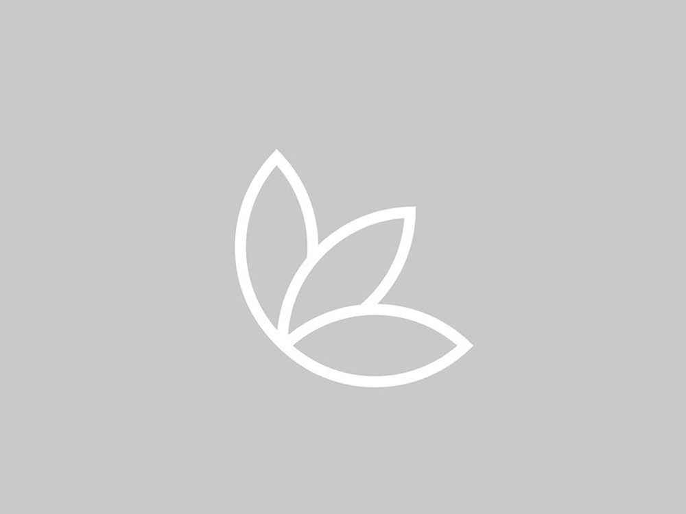
A leaf drawn as a single line, with the stop after the wordmark doing the rest of the work. The line weight never changes, which is what lets it survive embossing, a tube and a window sign at the same time.
Two greys and one typeface
Two greys with Lato Regular and Light carry everything else. Removing colour from a skincare brand is a risk, and here it is the point, because the product photography supplies the warmth.
Built to be implemented
Delivered with the construction drawn out, then applied to a tube, a jar, a pump bottle, a boxed bottle, a paper bag, folder and letterhead, a poster, and acrylic signage for the clinic.
What you receive
Files that hold up on packaging as well as on a screen.
Vector master and print files
Scales from a favicon to a shopfront sign without softening, with CMYK, transparent and one-colour versions your packaging printer can use.
Three to five directions
Separate directions, each with a reason behind it, so you choose the one that fits your range.
Original work you own
Full ownership transfers on delivery. Original work, not a template, so you can register it as a trademark.

Questions people ask
What makes a good skincare logo?
A restrained mark that stays legible on small, curved surfaces, works as a single colour for emboss, foil or etching, and reads as clean and considered rather than decorative. It should look the same on a tube, a jar and a clinic sign.
Why does line weight matter on skincare packaging?
Embossing, debossing, foil and etching cannot reproduce hairlines or widely varying strokes. A mark built from one consistent line weight survives all of them without being redrawn for each.
Should a skincare brand use colour?
It depends on the product. A limited palette is easier to keep consistent across a range. In the Tetomo identity, two greys carry the system and the product photography supplies the warmth.
Can you design packaging as well as the logo?
Custom projects such as packaging are quoted per project. The packages cover the logo with files for print, with stationery and a social kit in the higher tiers.
How long does a skincare logo take?
First concepts arrive in three days on the Basic package, four on Standard and five on Premium. Revisions on the chosen direction are unlimited.
Drawn by a human, from start to finish
From $70, first concepts in three days, unlimited revisions, and every file is yours at the end.